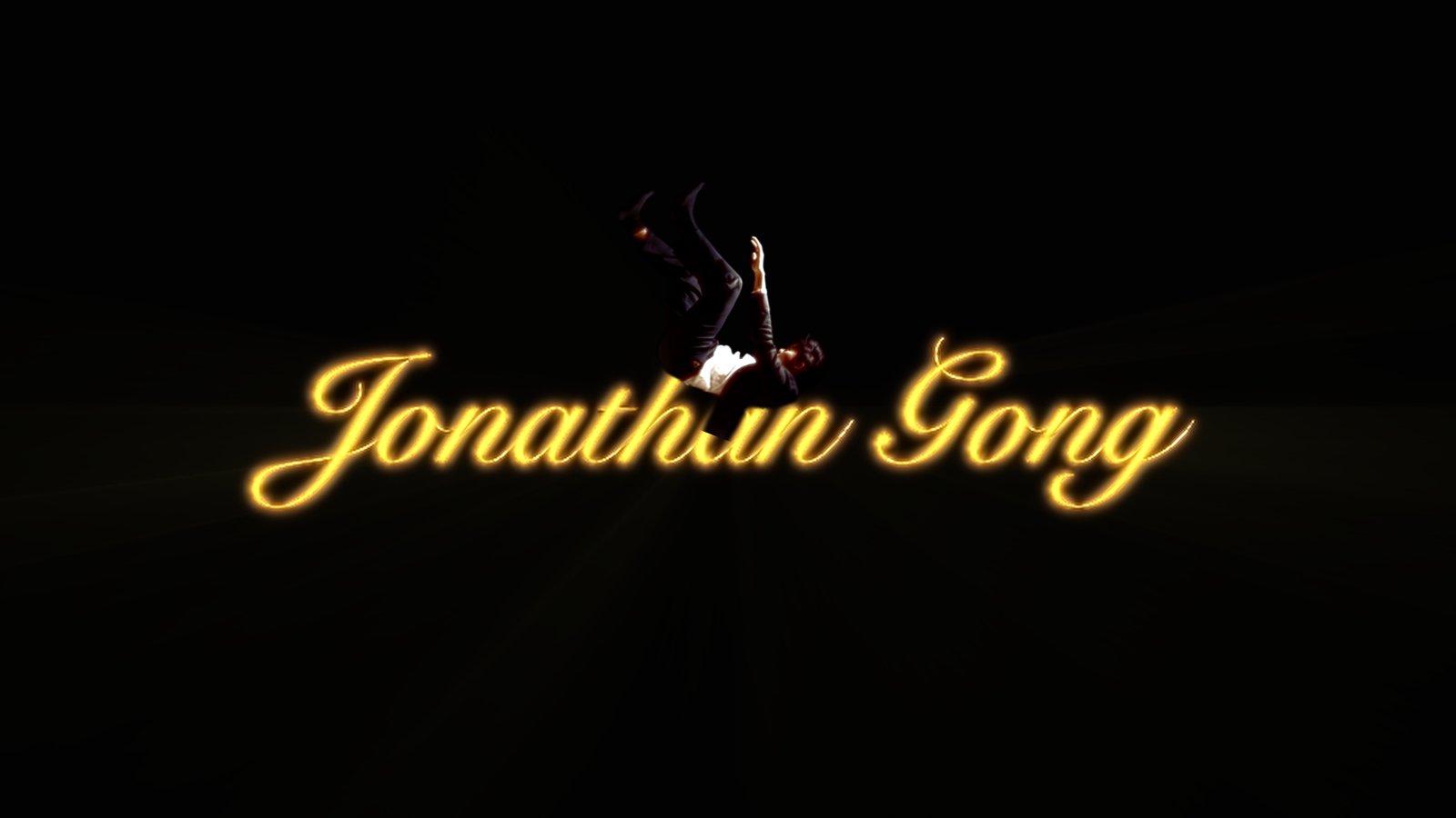
Identity frame
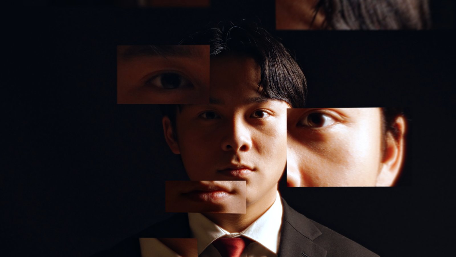
The portrait collage becomes the website’s hero still language.
The website opens directly on the film and uses the video as the main entrance into the project, pulling you into the story, production design, and creative process behind FBLA Digital Video Production.
The portrait collage becomes the website’s hero still language.
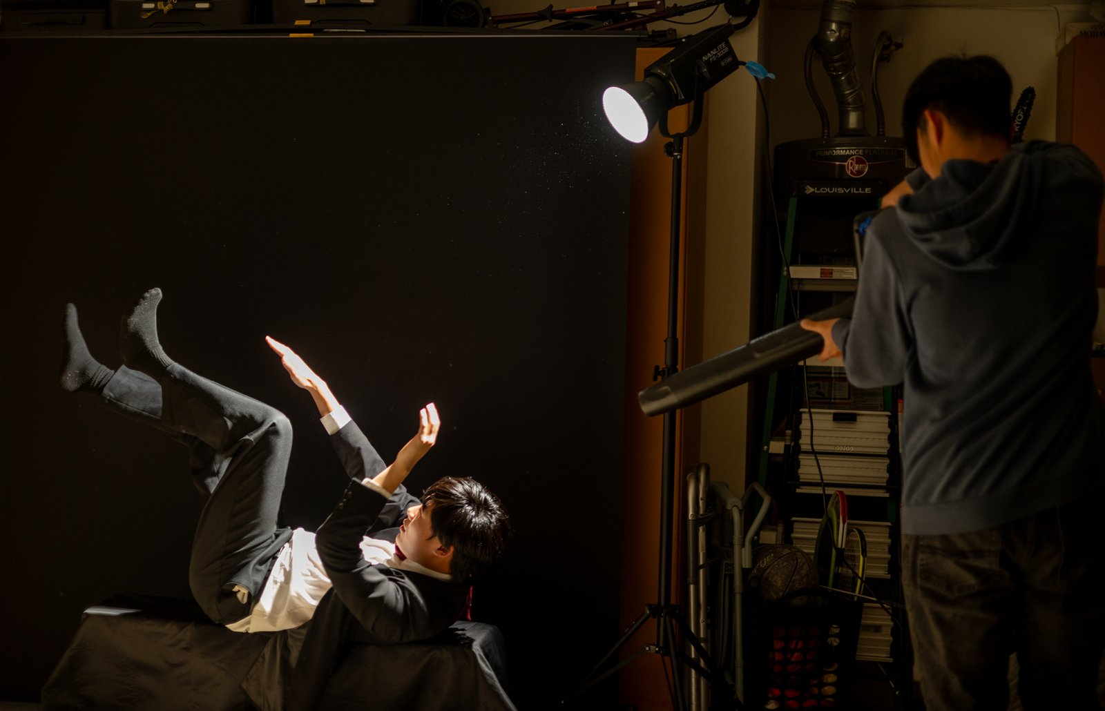
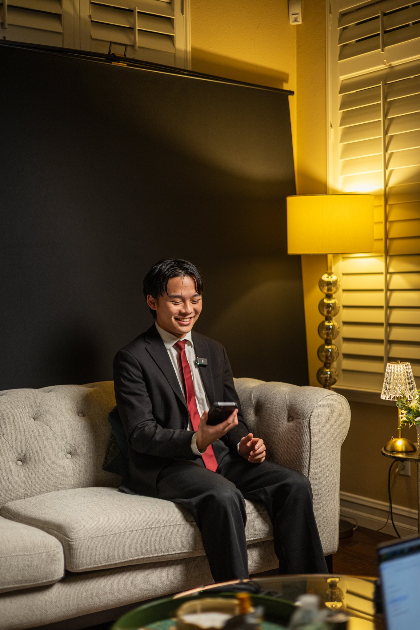
BTS images make the making of the video part of the design.
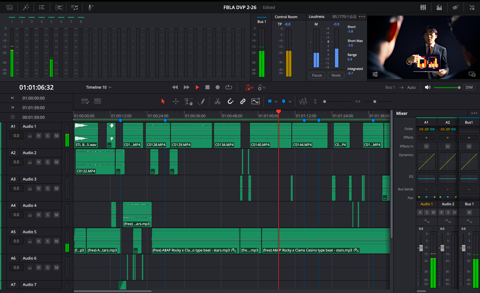
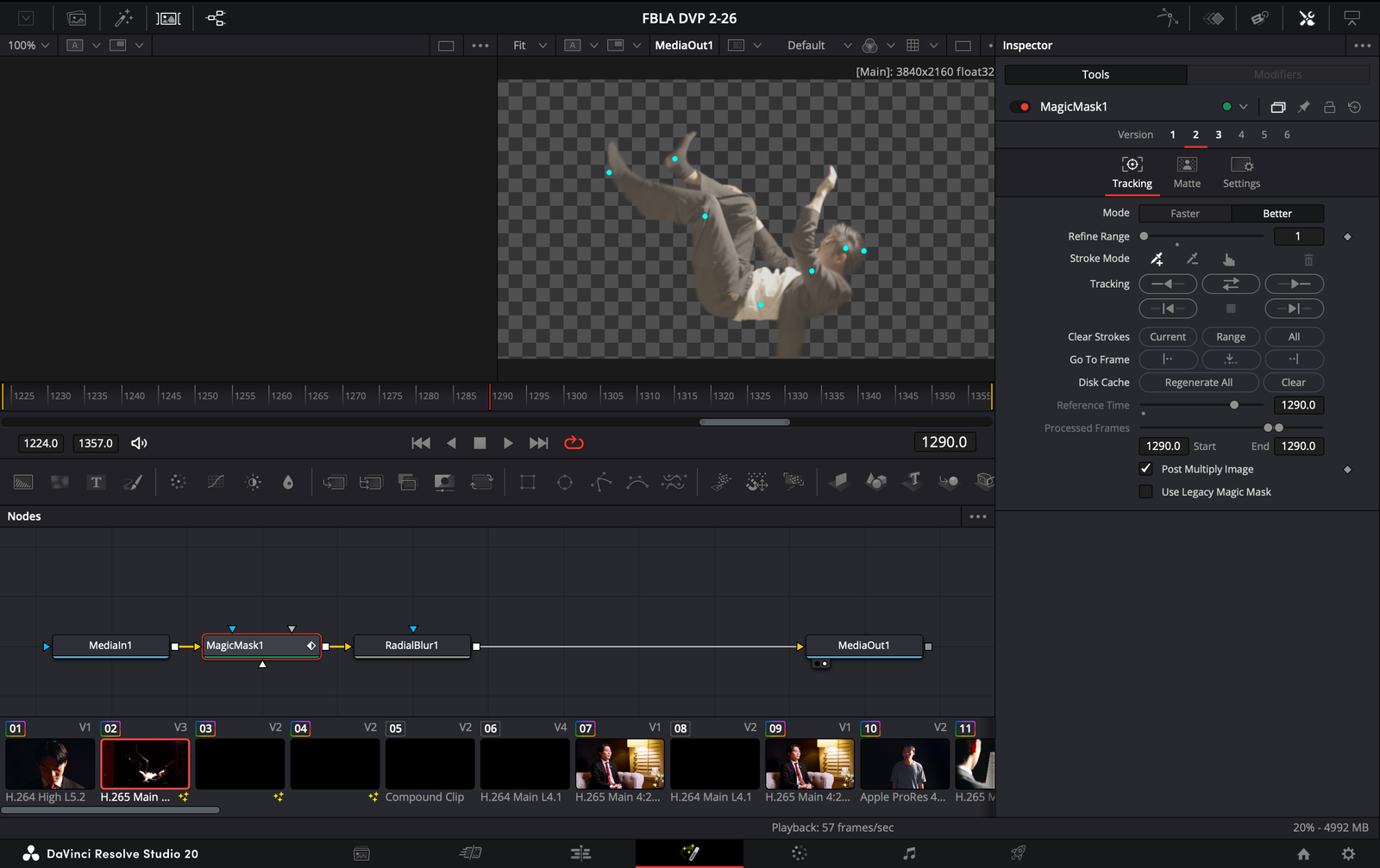
Resolve screenshots show how the final look was actually built.
This section makes the website itself a key part of the presentation: the film, the website visuals, and the behind-the-scenes process all work together in the same system.
Film
The website now gives the final video a stronger starring role.
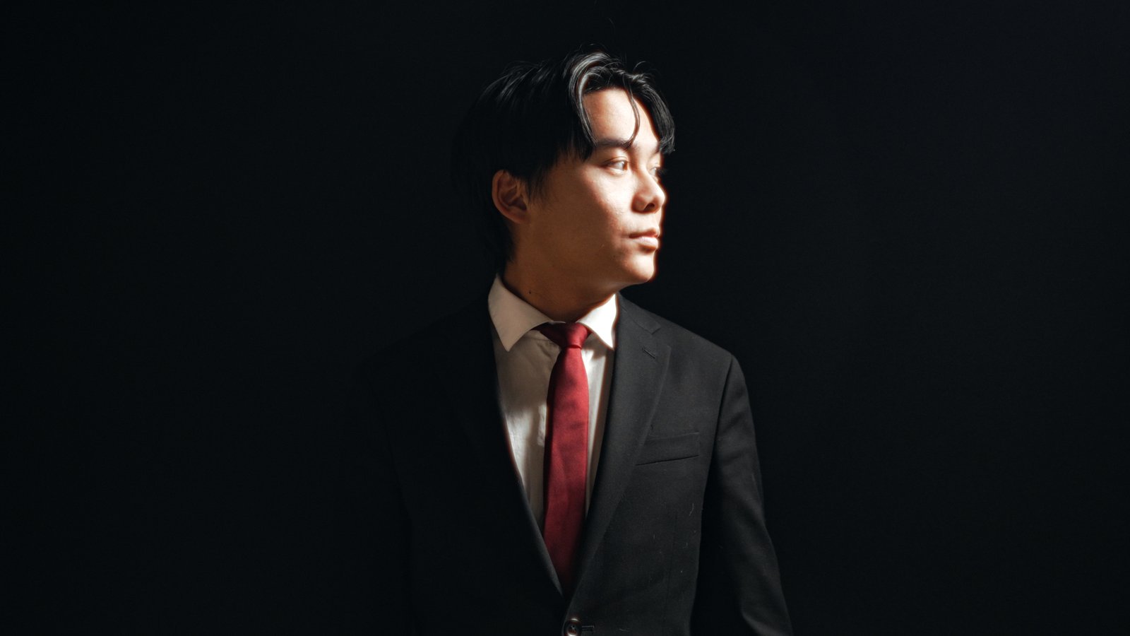
Website Visuals
Typography, title treatments, and darker spacing now feel more intentional and even.
Production
The film’s real production environment is showcased as part of the brand.
This replaces the camera model with a sleeker display section that feels closer to your reference: dark interface panels, glowing gradients, layered screens, and a stronger futuristic presentation for your FBLA digital video production.
Interface Direction
The site now pushes a more futuristic presentation language: stacked display cards, colder glow accents, larger dark surfaces, and more visual emphasis on the film, the edit timeline, and the post-production workflow.
The story was built in stages: concept, planning, shooting, and post. This section spreads the visuals out more and gives each part of the process more room to breathe.
The goal was to tell the story of Jonathan Gong and how FBLA shaped his development. That meant balancing professionalism, personality, and cinematic design instead of making a basic interview video.
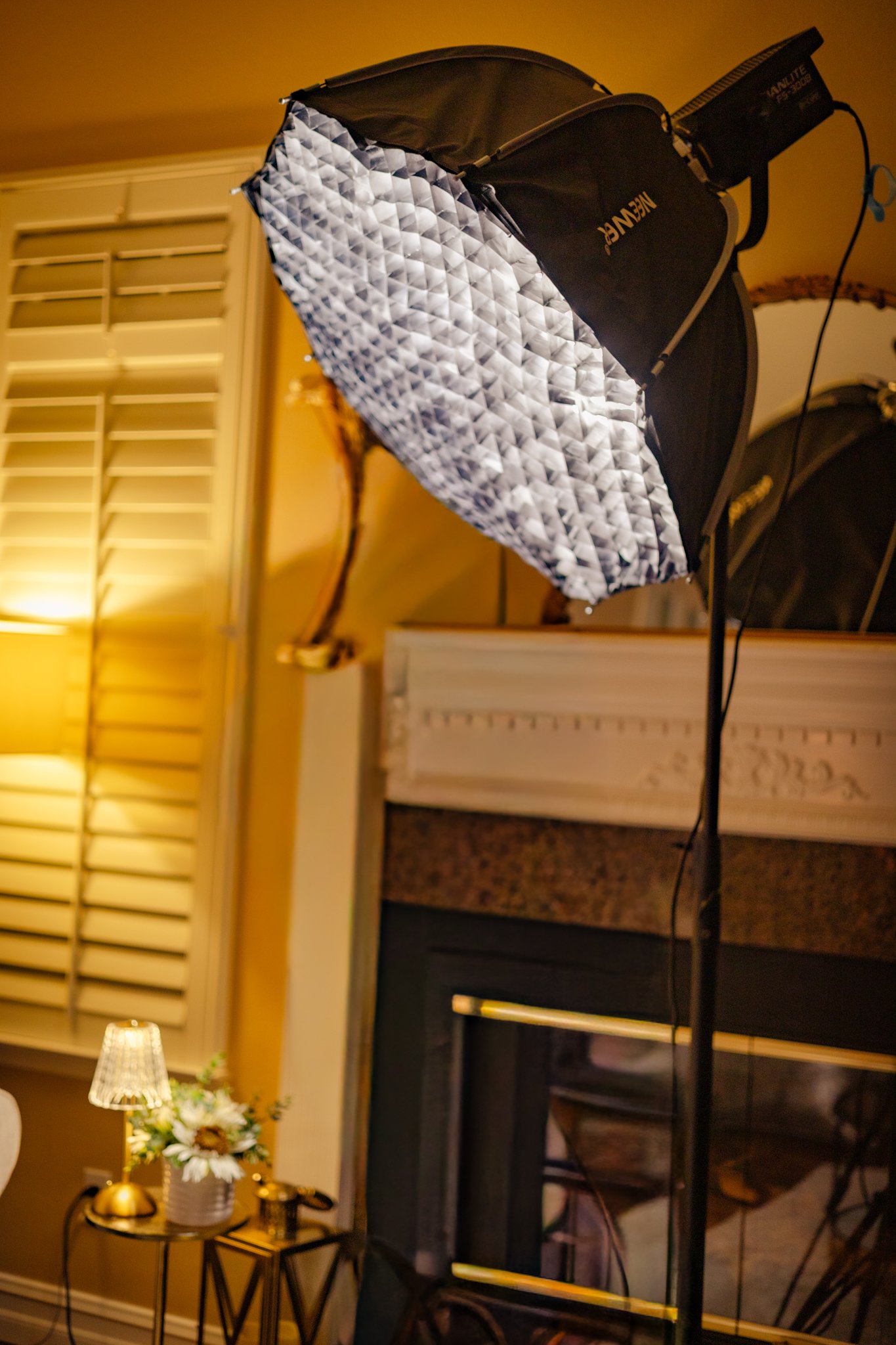
The warm practical look came from combining key lighting with ambient table and lamp sources to shape a clean, inviting but still dramatic frame.
The black backdrop and couch setup helped isolate the subject while still keeping the environment warm and human through the practical lights.
Discord calls, in-person meetings, sketches, and storyboards shaped the approach. The team explored standard-offset, interrotron, and conversational interview references before deciding how the story should flow.
Meetings / Storyboards / Interview Strategy
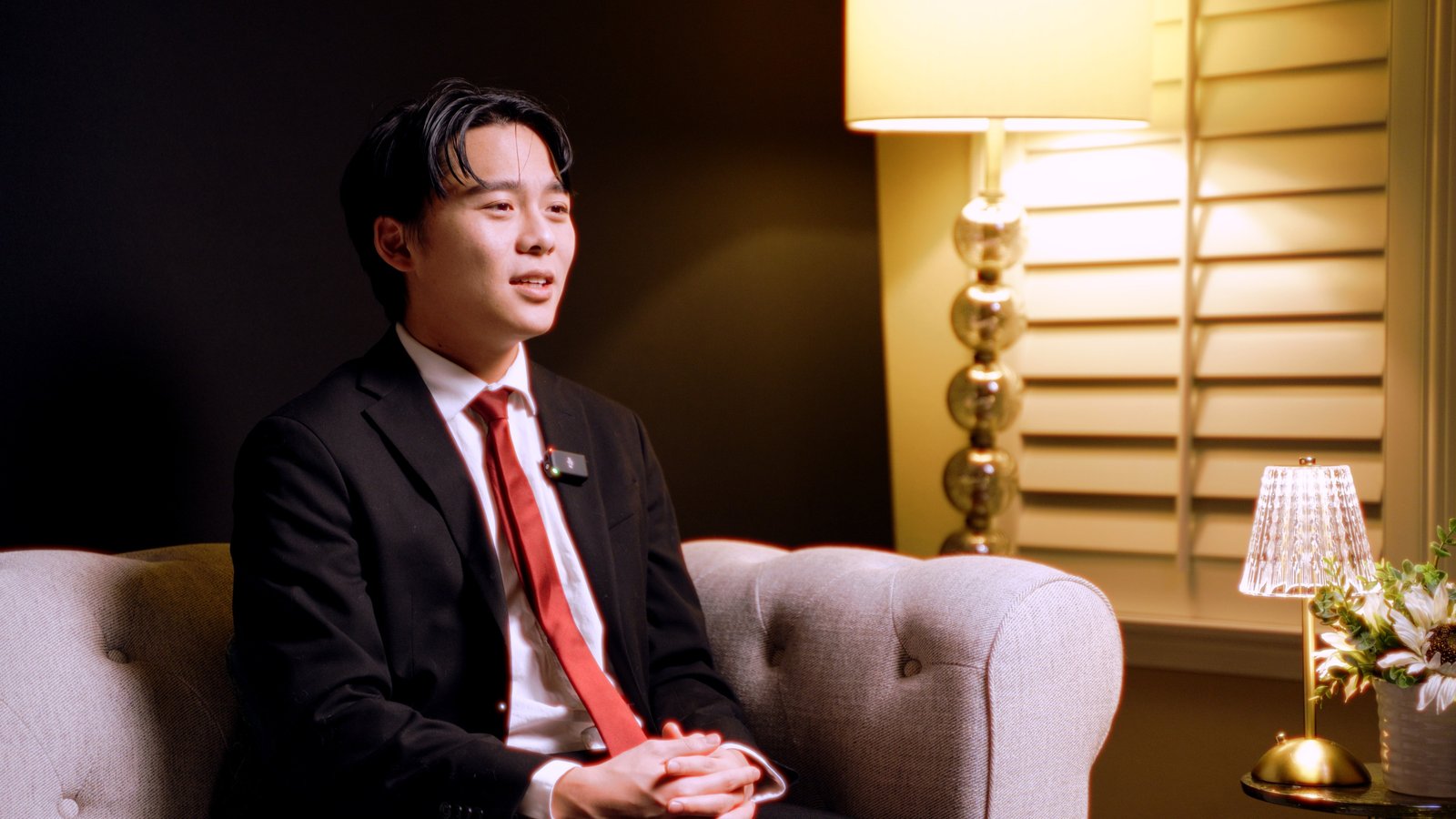
Negative space, close-ups, over-the-shoulder framing, and strong contrast helped direct attention. The film leans on clean visual discipline to make the subject feel more important and more intentional on screen.
Centered Framing / Shallow DOF / Practical Lights
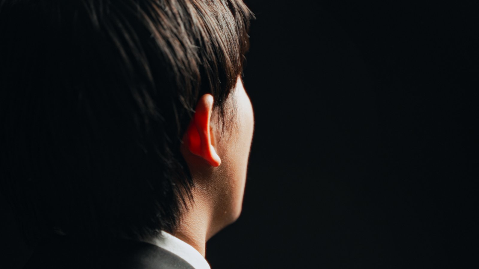
You asked for more aspects of the video throughout the website, so this section adds motion beyond the hero by embedding the screen recordings from the edit and grading workflow directly into the page.
The main film shows up again deeper in the site so video stays present throughout the experience instead of only in the hero.
The timeline build shows how clips, b-roll, portraits, and transitions were arranged to control pacing and visual escalation.
This moves the post-production process into the site itself so the grading and finishing don’t feel disconnected from the film.
These panels use the actual DaVinci Resolve screenshots to show the film being built, not just the final result.
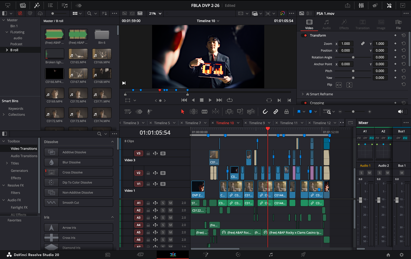
The cut page and edit page show how the piece was assembled from multiple layers of interview, b-roll, and title design.
The Fusion screenshot highlights effect work and masking used to support stylized visuals like the floating composition sequence.
The edit timeline reveals how the site’s motion language can be inspired by the actual timeline structure of the film.
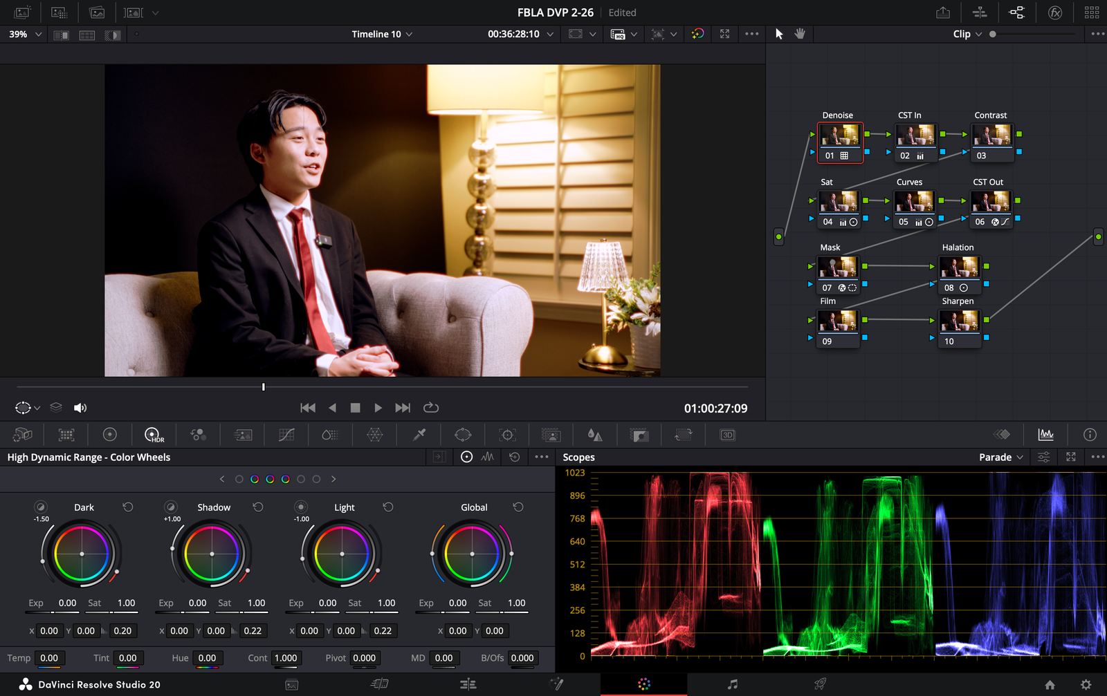
The node tree shows denoise, CST, contrast, saturation, curves, masking, halation, film texture, and sharpening all working together.
The grading panel now starts as a greyed-out version and reveals the finished warm cinematic treatment as you drag. It is designed to feel more interactive and clearly show how the grade transforms the frame.
Grade / 01
Drag the divider
The look is built around warm highlights, controlled contrast, refined skin tone placement, and clean shadow depth. It keeps the frame cinematic without losing the natural professionalism of the interview.
This screenshot anchors the grading section in the actual post process, showing that the final look came from a structured node tree, not a random LUT drop.
This combines the slideshow gear list with the new behind-the-scenes setup photos so the site feels more complete and less compressed.
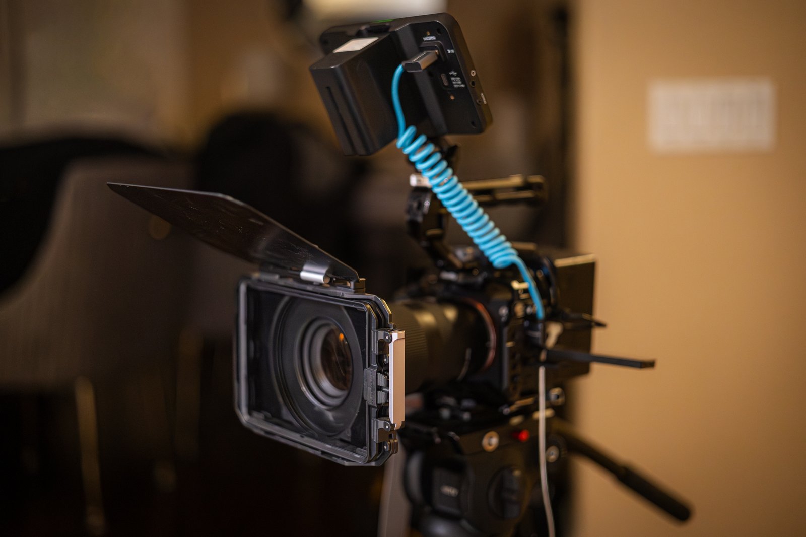
Main camera body for the interview and controlled portrait sequences.
Soft source plus practical warmth for the polished cinematic mood.
Black backdrop, couch placement, and room practicals working together.
Behind-the-scenes proof of the experimental visual construction in production.
Instead of cramming every image onto the homepage, the stills are spread out into a separate gallery page so the main site stays cleaner while still giving the photography room to breathe.
Open Gallery Page